Section layouts by type
Compare every layout for each section type on real screens, with variants such as columns, photo ratio, and heading position.
A website page is a stack of sections. Each section combines the content it shows with a layout that arranges that content. This page lists every layout Laney uses for each section type. It also shows the variants you get when you change options such as columns, photo ratio, heading position, and width.
To change a layout, see Edit your website. When you ask the AI, use a shape name from this page or the layout value in parentheses.
What this reference helps you decide
The right shape depends on the item count, whether you have photos, and how long the text is. Some shapes work only with a matching item count. For example, three columns of cards fill without empty cells when you have 3 or 6 items. One-at-a-time slides need 5 or more items. Each shape below lists its conditions. The copy and images stay the same when you change a layout, so you can compare freely.
Example: a clinic's treatment page. The first screen uses the photo background first screen from a content section. Three features use alternating photo and text in a features section. A three-step process uses numbered horizontal steps in a steps section. When the process grows to four steps, the numbered steps leave an empty cell, so the clinic switches to a vertical timeline.
The screens below come from the Laney website renderer with sample data. Sample drawings stand in for photos, and sample sentences stand in for copy. Your website uses your own photos, copy, theme colors, and fonts.
Content sections: first screens and bands
A content section (content) puts a heading, description, and buttons on a photo or a color band.
Use it for the first screen, a mid-page consultation prompt, and the closing booking prompt. It is
complete on its own and has no child items.
Photo background first screen (photo background on, size lg)

A full-width photo with the heading and buttons on top. This is the default first screen.
Photo band (photo background on)

A short photo band in the middle of the page. It breaks the flow and invites a consultation.
Soft photo band (photo background on, backdrop soft, screen rounded)

A faded photo that reads like a texture. The text keeps its dark color.
Large photo under the heading (photo background off, show photos on)

The heading and description come first, with a large photo below. Use it for a first screen where a person or an article is the focus. No text covers the photo, so faces stay clear.
Single item on gray (photo background off, show photos on, background color muted)
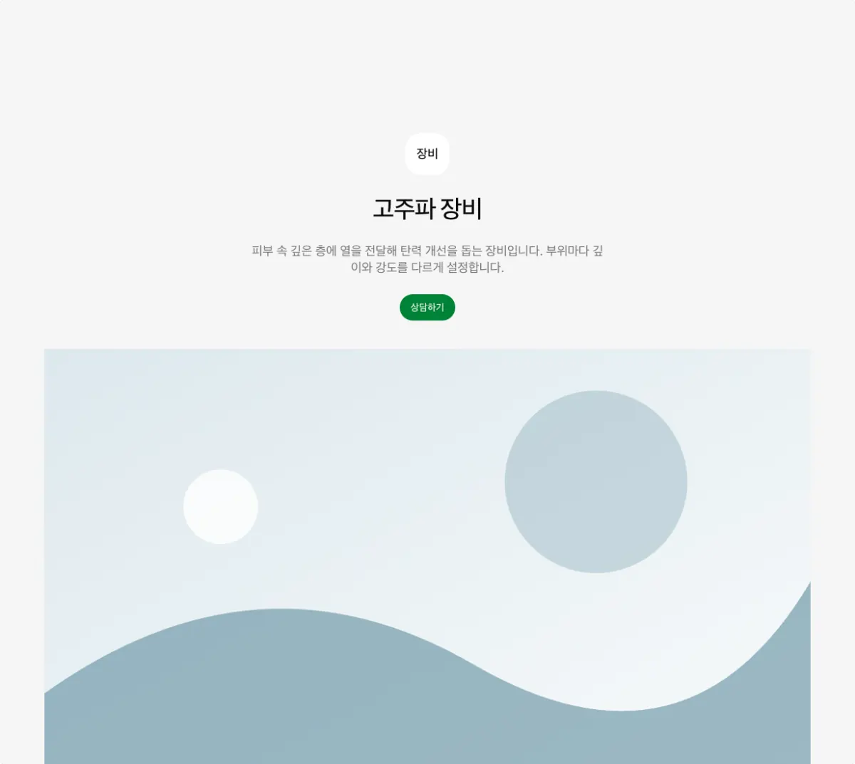
Introduces one device or treatment with a photo on a gray background. Use it instead of a card group when you have only one item.
Gray text band (background color muted)

Copy and buttons only, with no photo. Use it for a mid-page consultation prompt.
Theme color closing band (background color primary, alignment center)

Booking and consultation buttons on the theme color. Use it once, at the end of the page.
Features sections: show several items
A features section (features) shows content with several items, such as treatments, devices,
medical staff, and care principles. You can show the same items in a different shape by changing
the layout. Each layout has an item count that fits it. Each shape below lists its conditions.
Card group columns and photo ratio
The card group (grid) is the most flexible shape. You can change the columns and the photo
ratio. The item count must divide evenly by the column count, or the last row has empty cells.
With 9 or more items, use moving cards instead of a card group. A list page can show 9 or more
items in a card group.
Two-column cards (grid, columns 2)
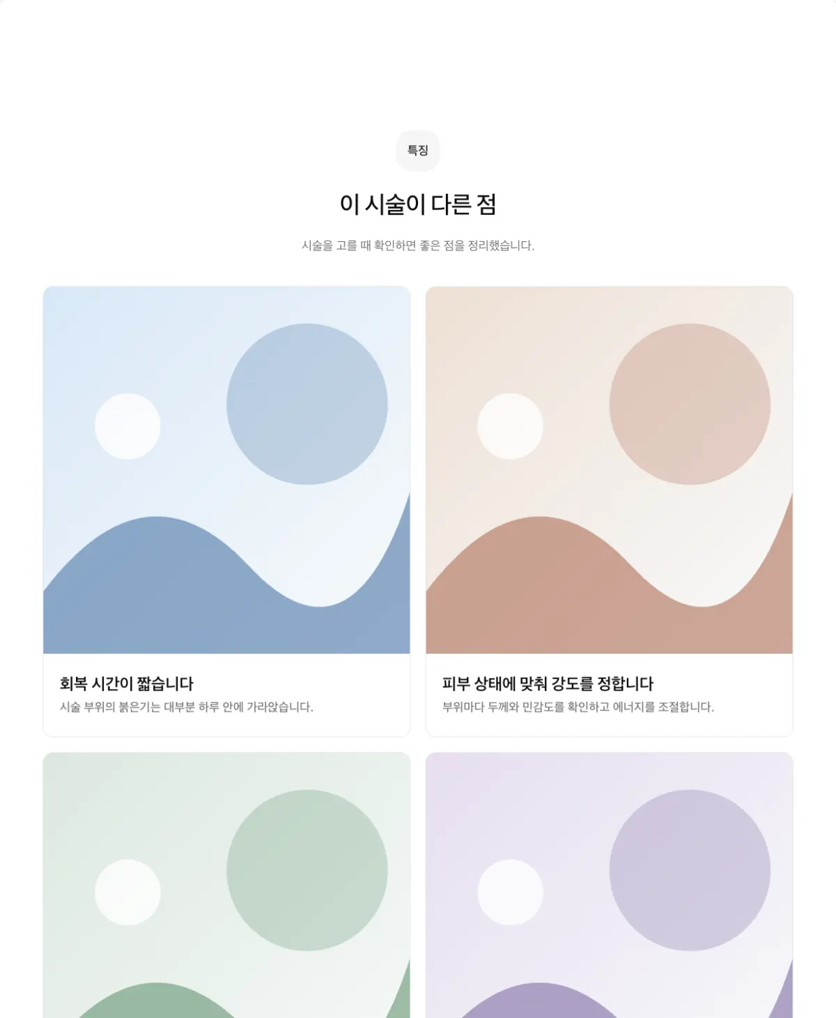
Two cards per row. Use it for 2 or 4 items.
Three-column cards (grid, columns 3)
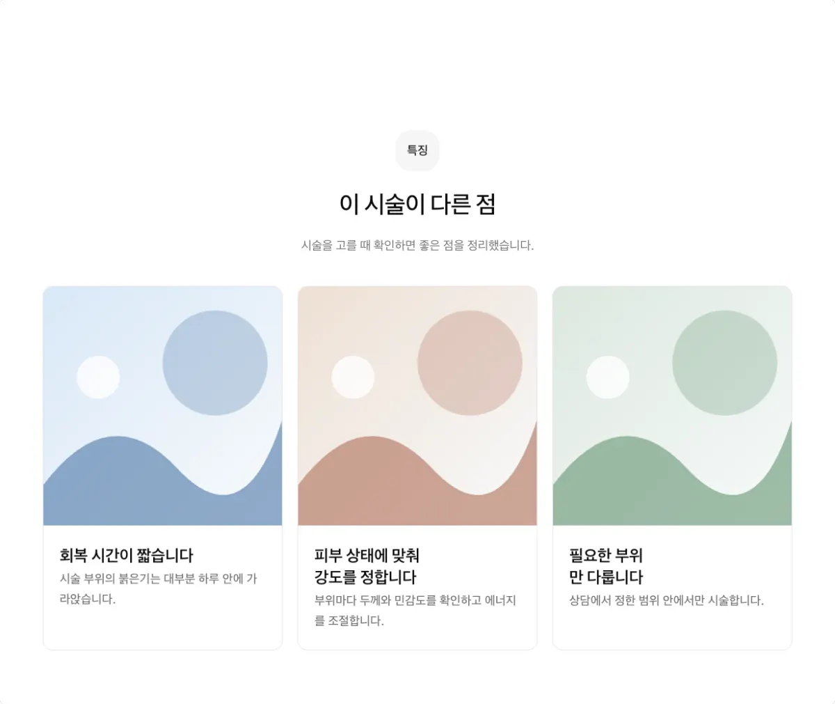
Three cards per row. Use it for 3, 6, or 9 items.
Four-column cards (grid, columns 4)
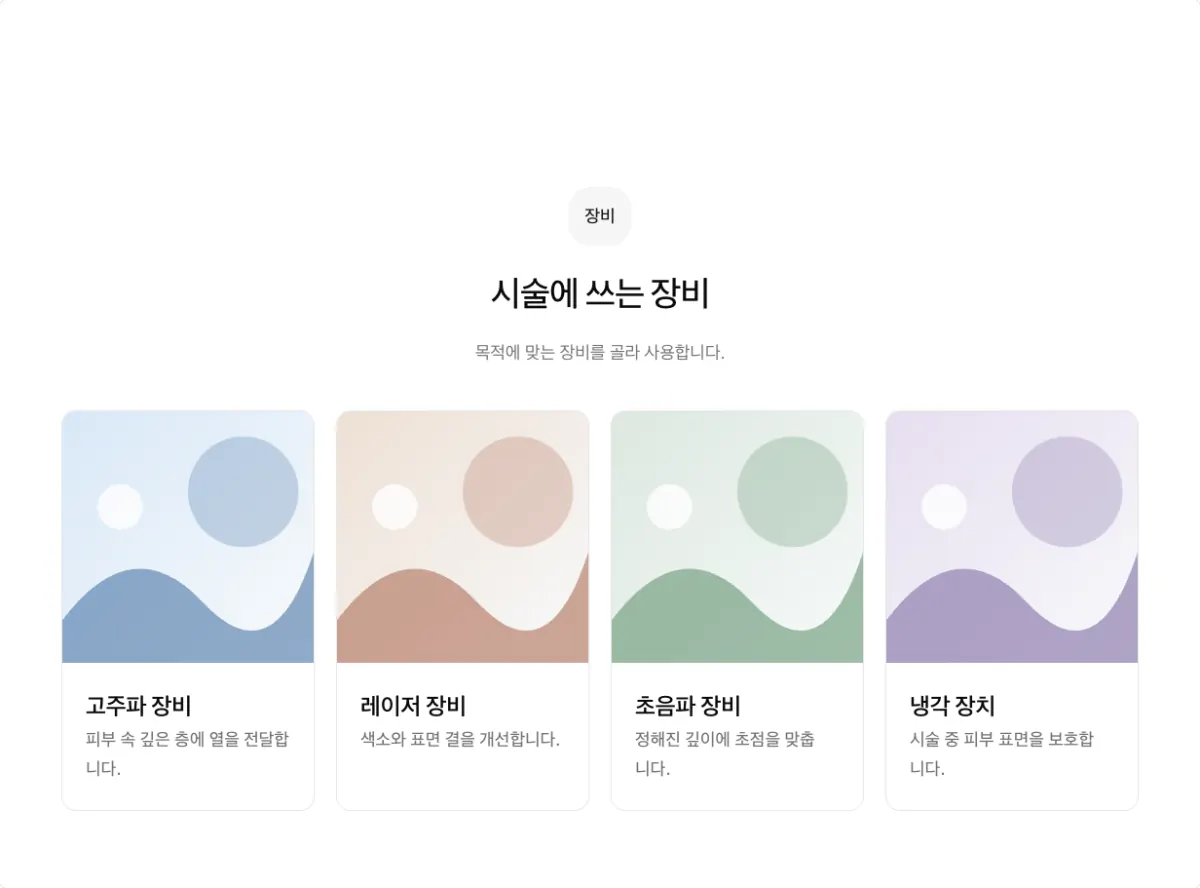
Four small cards per row. Use it for 8 items, such as a device list. For 4 items, the default is two rows of two.
Tall photo cards (grid, photo ratio tall)
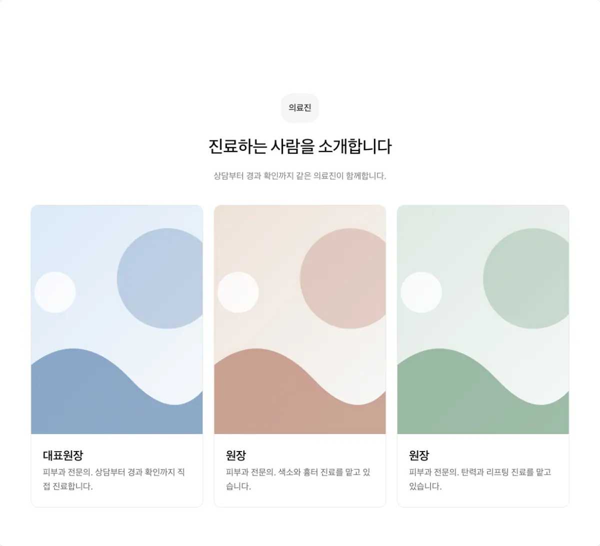
Crops photos tall to fit portraits and full-body photos.
Wide photo cards (grid, photo ratio video)
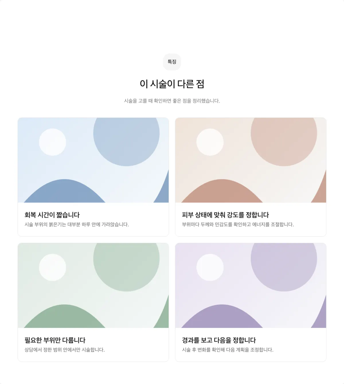
Crops photos wide to fit spaces and scenes. Choose the photo ratio from square, photo,
video, wide, and tall.
One large item (grid, columns 1, side by side on)
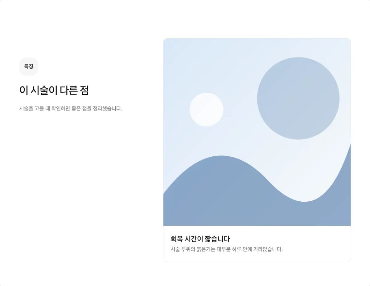
One large photo card next to the heading, for a single item. A card group with one item must use one column with side by side on.
Photo cards and photo groups
Photo cards under the heading, three columns (photo-card, columns 3)
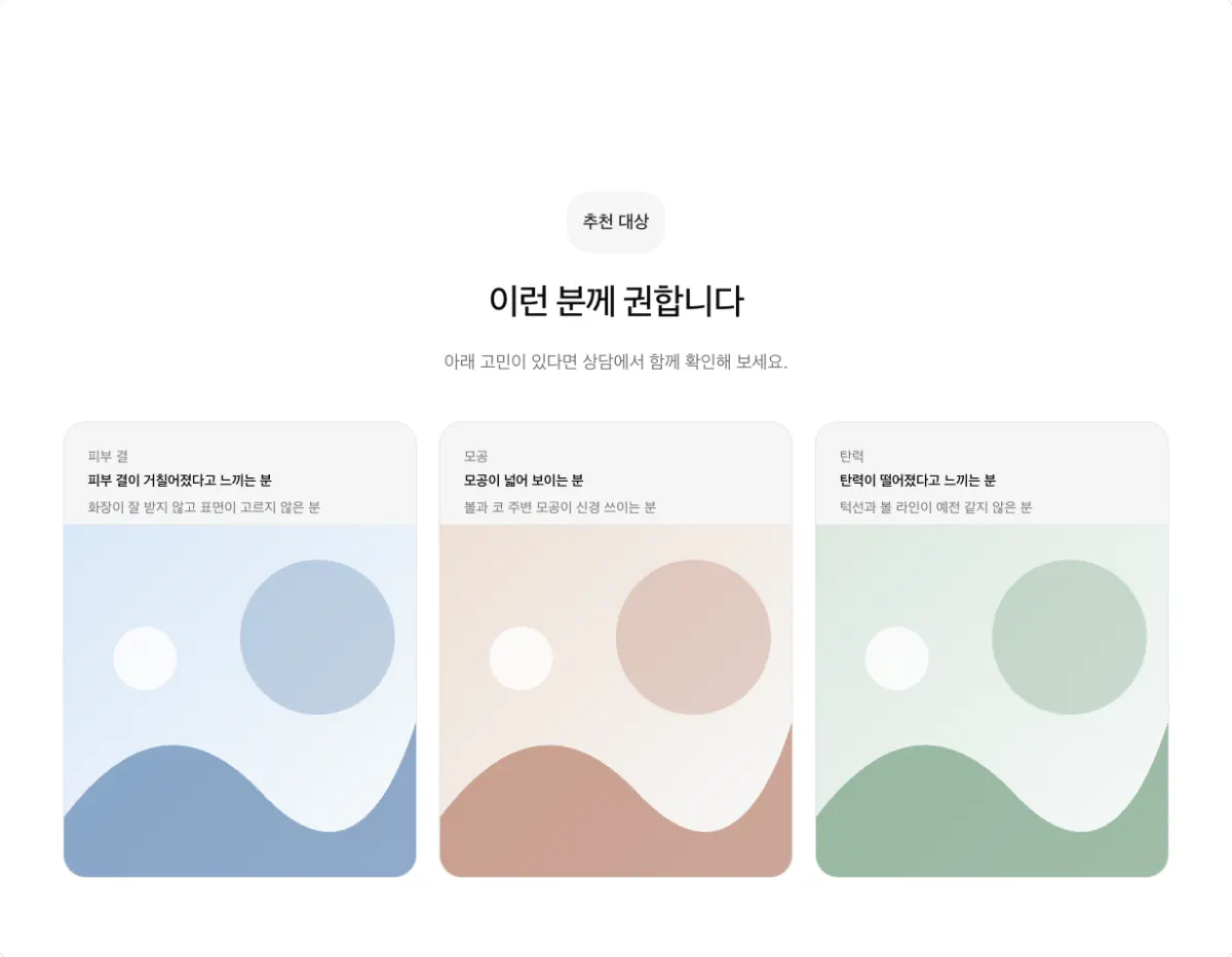
The photo sits under each card heading, so a cutout photo or character reads as one unit with its heading. The item count must divide evenly by the column count. For three columns, use 3 or 6 items.
Photo cards under the heading, four columns (photo-card, columns 4)
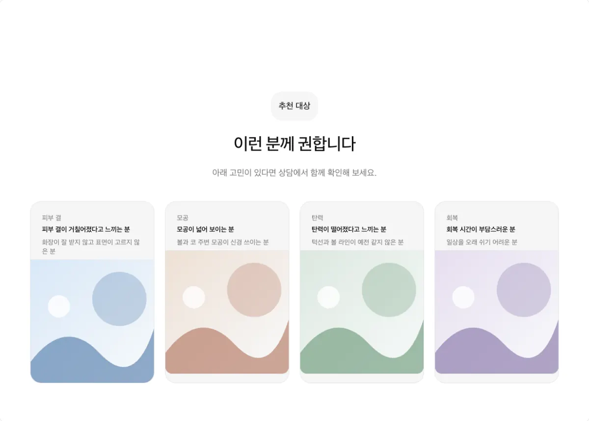
Shows four concerns in one row, for example who a treatment is for. Use it for 4 or 8 items.
Borderless photos, three columns (gallery, columns 3)
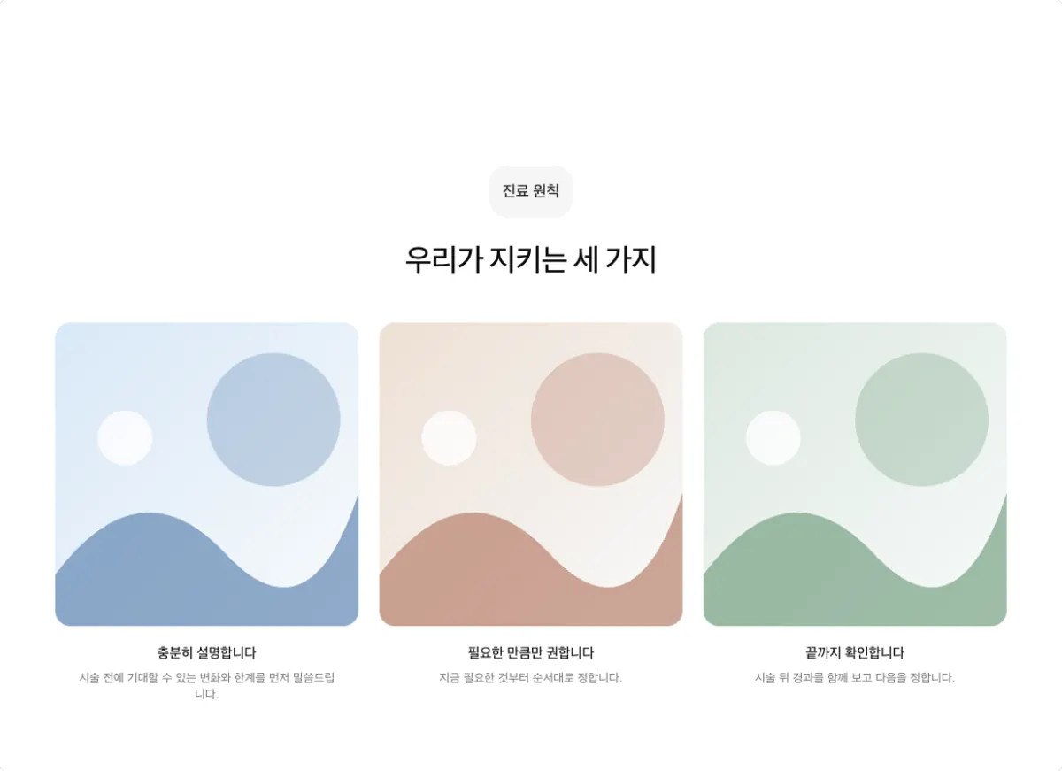
Photos and captions with no card border. Use it to keep the photo ratio, for example for care principle illustrations. The item count must divide evenly by the column count.
Borderless photos, two columns (gallery, columns 2)
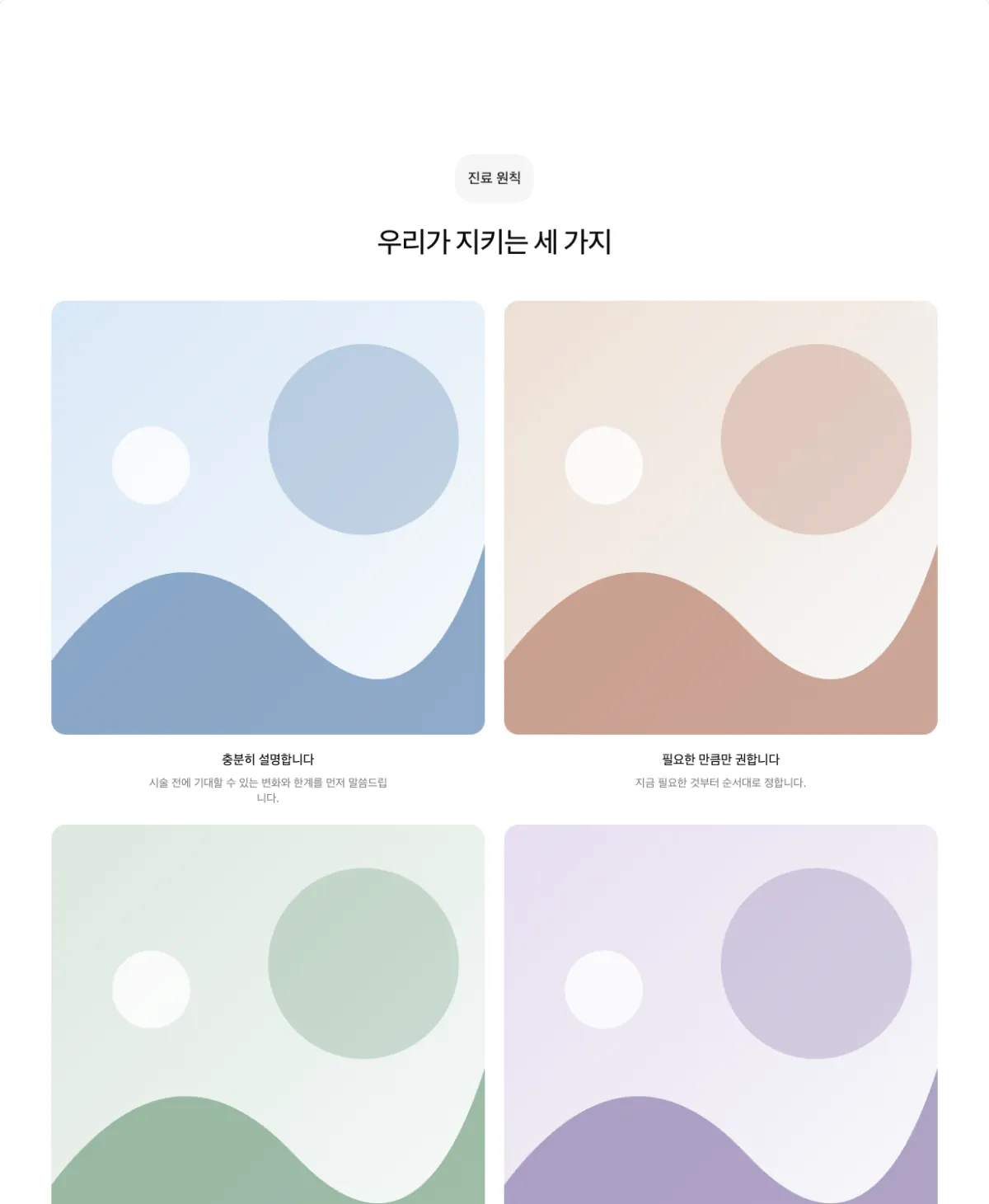
The same shape, larger, with two per row. Use it for 2 or 4 items.
Featured photo (showcase)
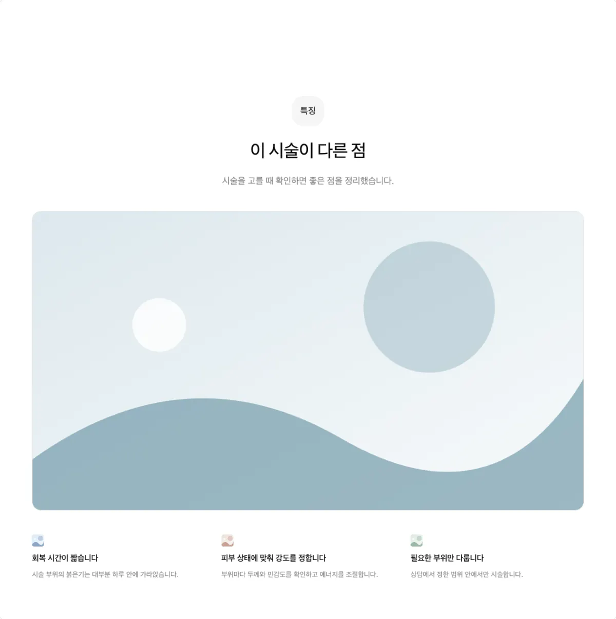
One large section photo with the items beside it. The item count must be a multiple of 3, such as 3 or 6.
Mixed-size photo group (bento)
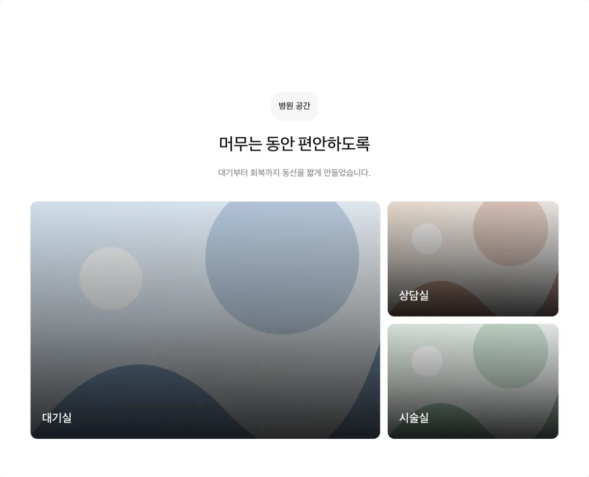
Three photos in mixed sizes, like a magazine page. Use exactly 3 items, and every item needs a photo. Mix it in when a page already has many sliding sections, so the page does not feel repetitive.
Overlapping photos (collage)
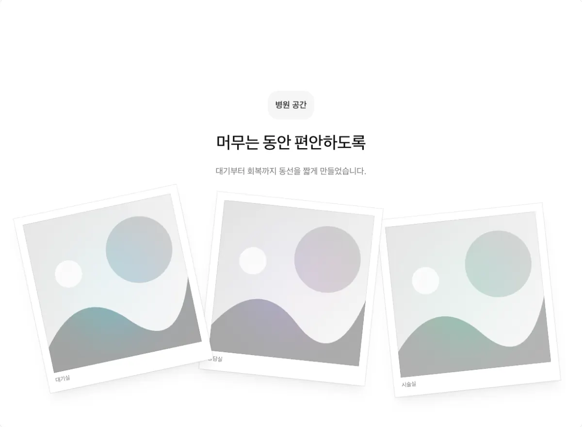
Three photos, slightly tilted and overlapping. Use exactly 3 items.
Text on photos
One large and two small photos (overlay)
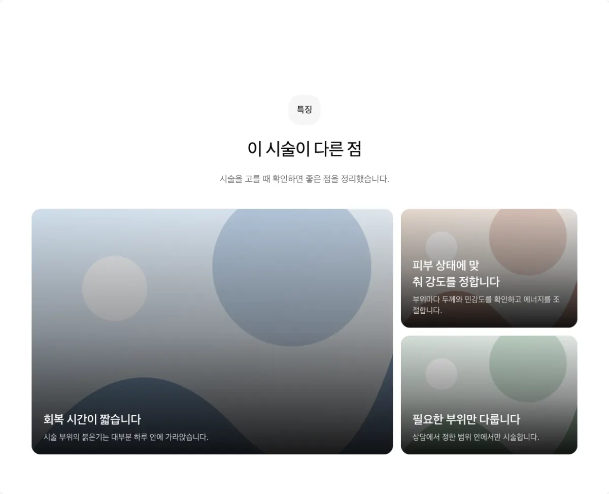
Highlights one of three items, with headings on the photos. Use exactly 3 items, and every item needs a photo.
Text on photo tiles (overlay-grid, columns 2)
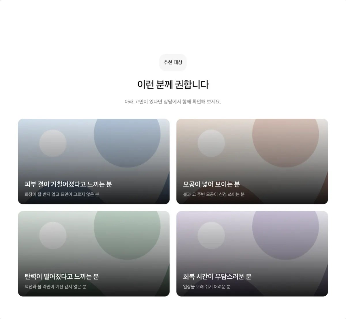
Headings on equal photo tiles. Use 2 or 4 items, with side by side off.
Text on photos, stacked (overlay-grid, columns 1, side by side on, photo ratio video)
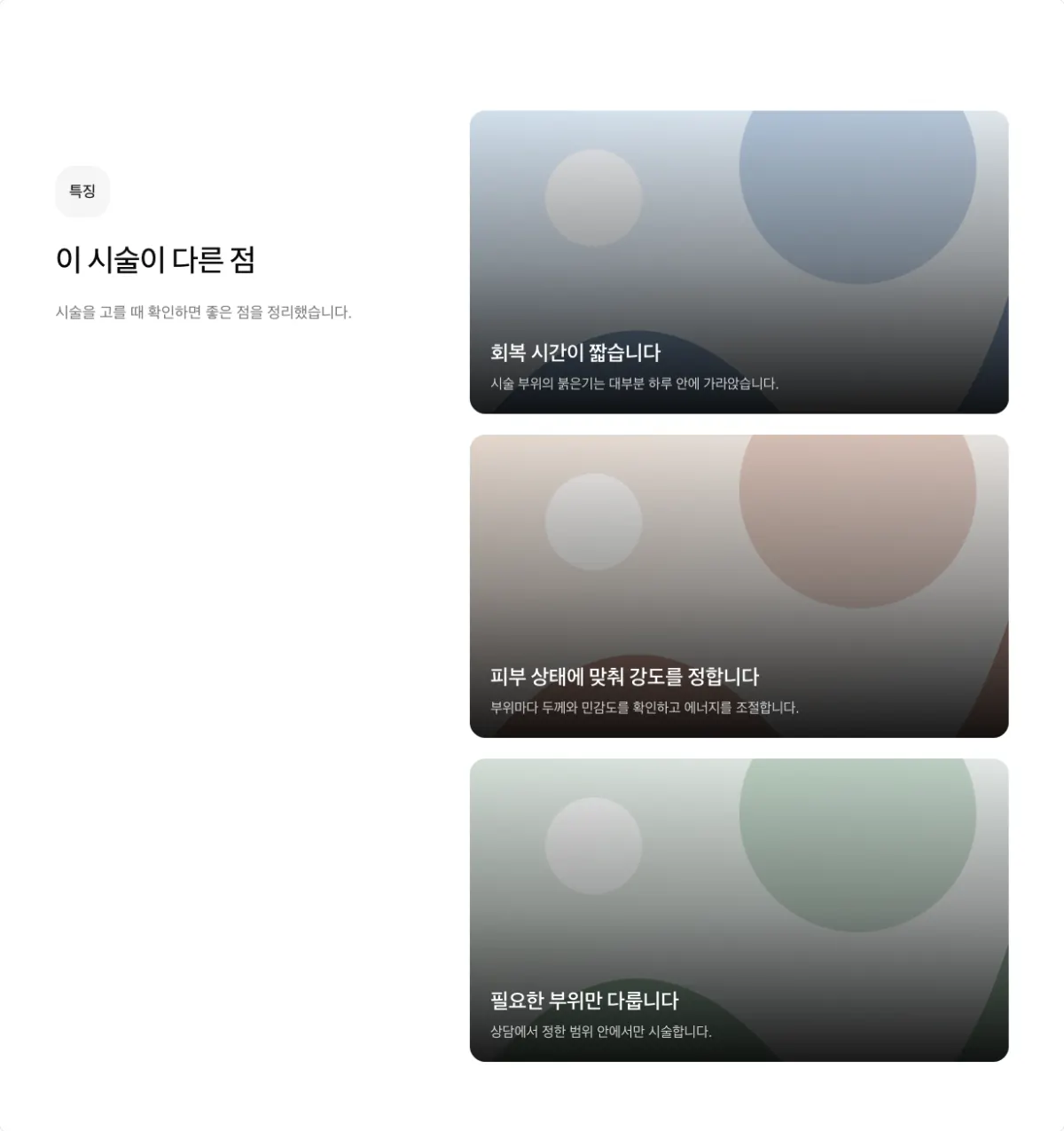
Wide photo tiles stacked next to the heading. Use up to 4 items, and use it once per page.
Sliding shapes
Do not use a sliding shape for 2 items. For 2 items, use two-column cards or alternating photo and text.
Moving cards (carousel)
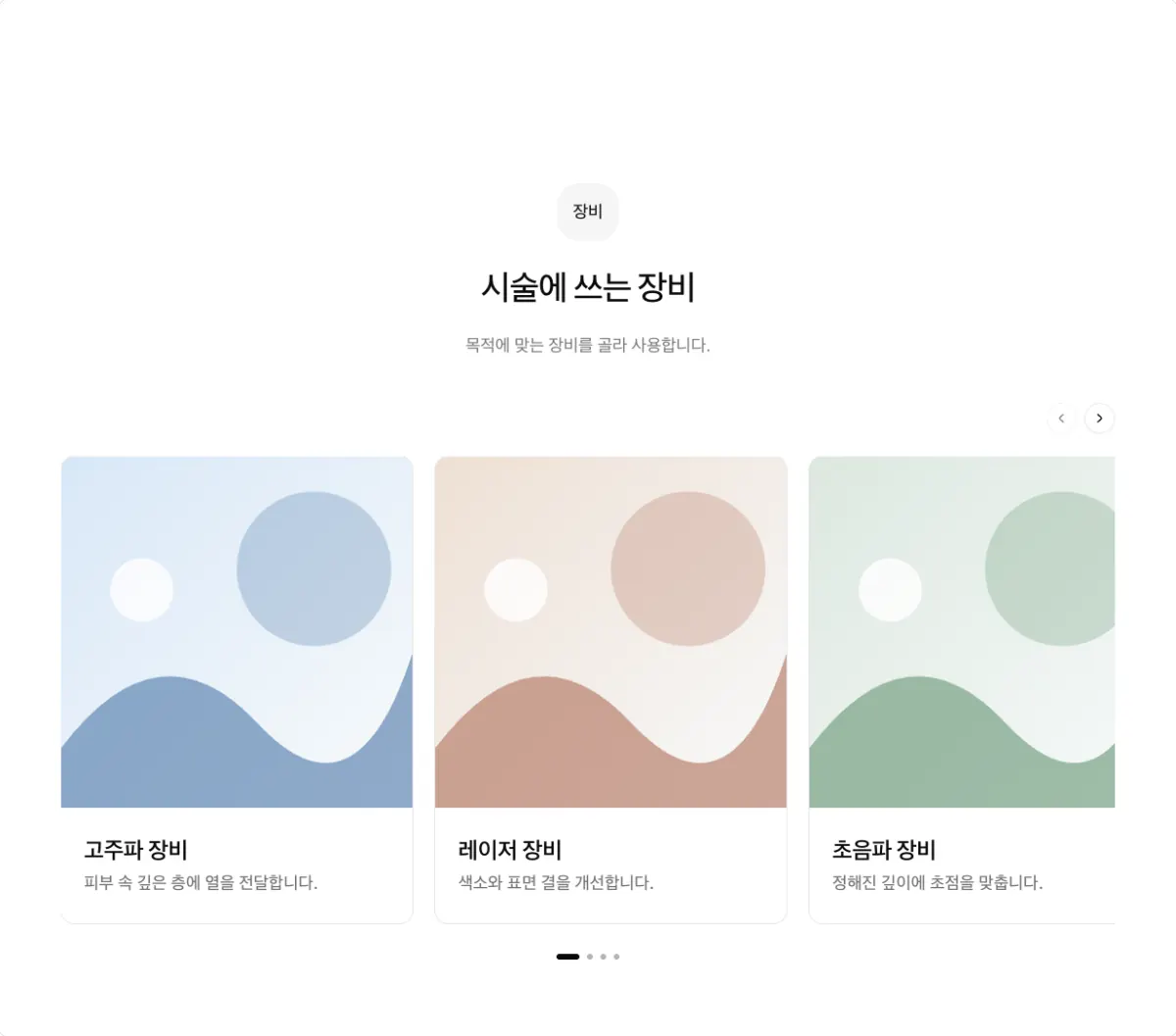
The cards move on their own. Use it for longer lists such as devices or related treatments. Use 3 or more items. With 9 or more items, this is the default.
Edge-to-edge moving cards (carousel, width full)
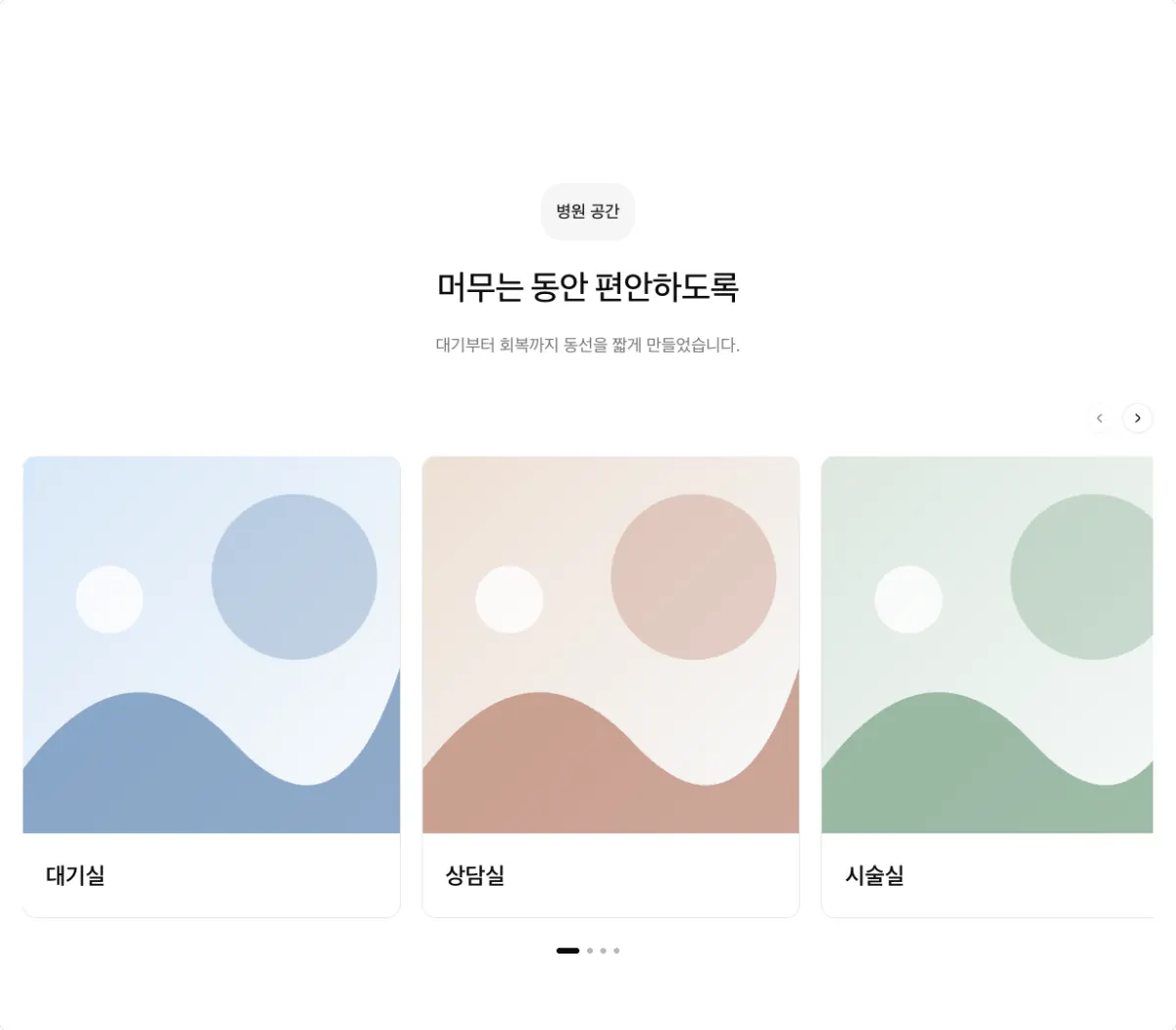
The card row runs to both edges of the screen. Use it for clinic space photos.
One-at-a-time slides (slider)
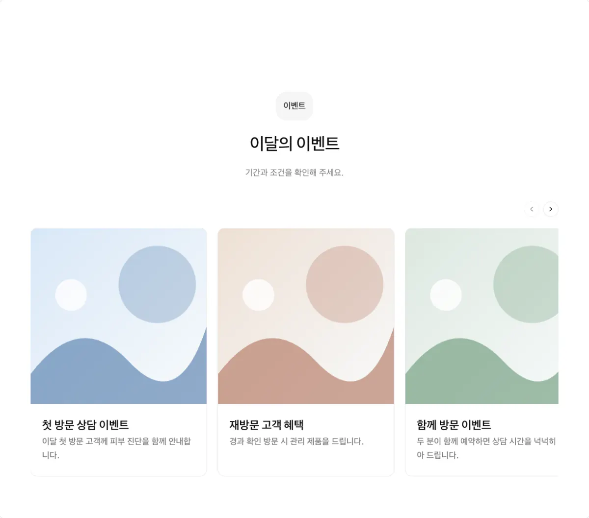
Shows one large item at a time, with arrows. Use it for 5 or more items.
Wide photo track (gallery-track)
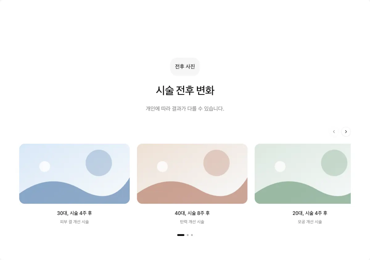
Slides wide photos, such as before and after photos, without cropping them. Use 3 or more items. Use only real before and after photos. Check patient consent and medical advertising rules first.
Vertical videos (reels)
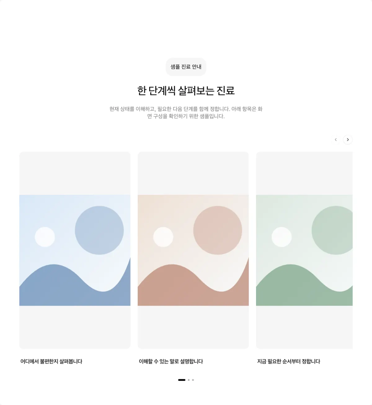
Short vertical videos side by side on a sliding track. Use 3 or more items.
Video cards (video, columns 2)
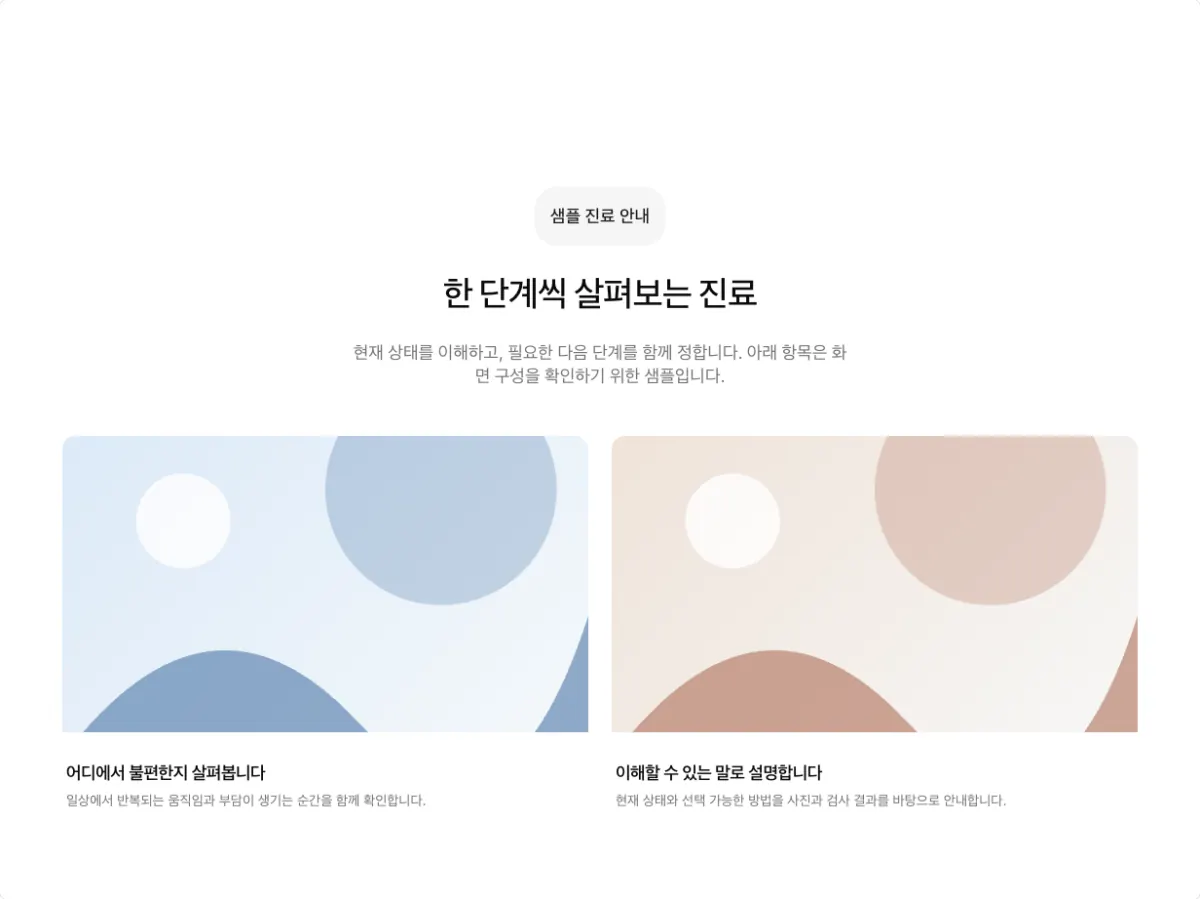
YouTube videos as cards that play on selection. The item count must divide evenly by the column count.
People and stories
Medical team cards (team, columns 3)
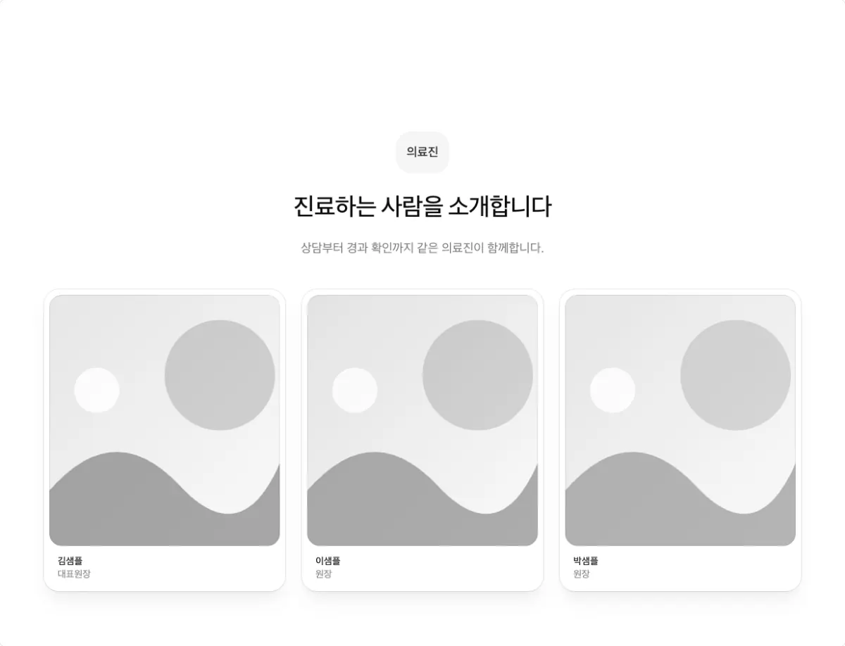
Doctor photos with names and titles side by side. The number of people must divide evenly by the column count.
Alternating photo and text (zigzag)
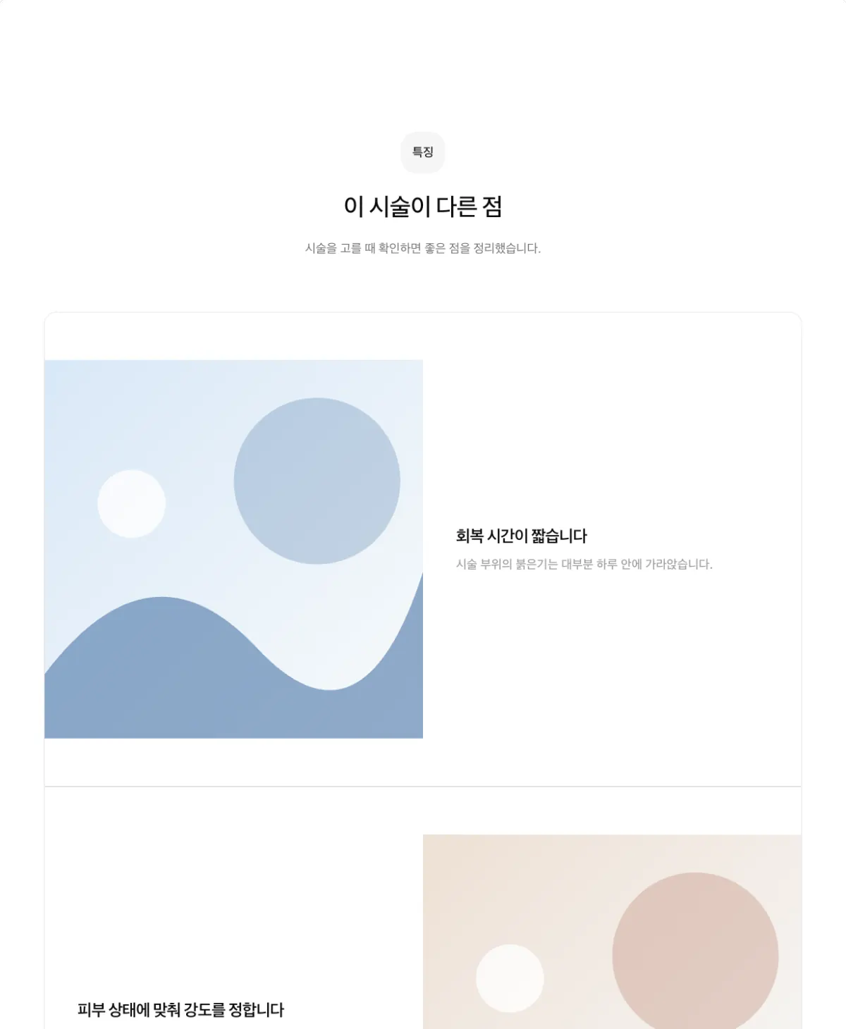
Photos and descriptions alternate sides. This is the default for 4 or fewer features. Use 5 or fewer items, or an even number. More than 5 makes the page long. Keep side by side off.
One doctor at a time (zigzag, medical team items)
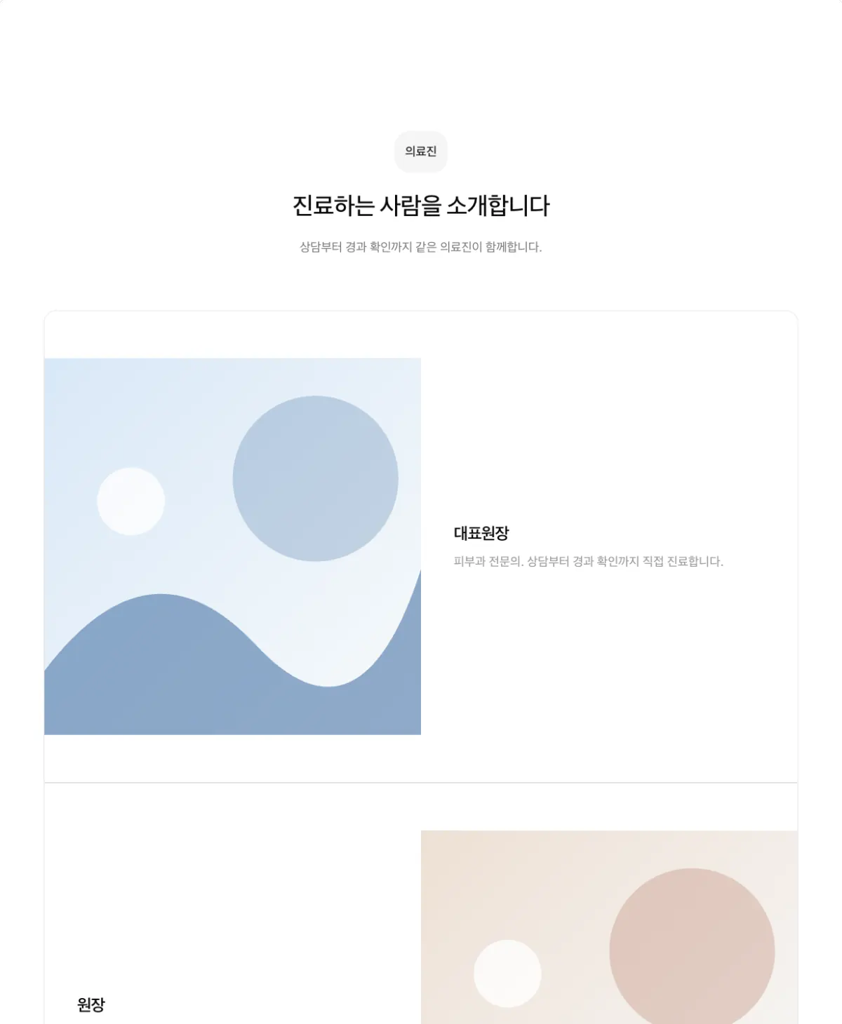
For one or two doctors, alternates photos and long profiles.
Photo history (timeline)
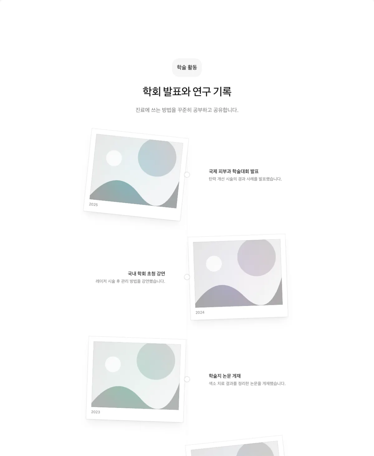
Framed photos follow a center line. Use it for conference activity or clinic history.
Text-focused lists
One-line list (list, list style minimal)
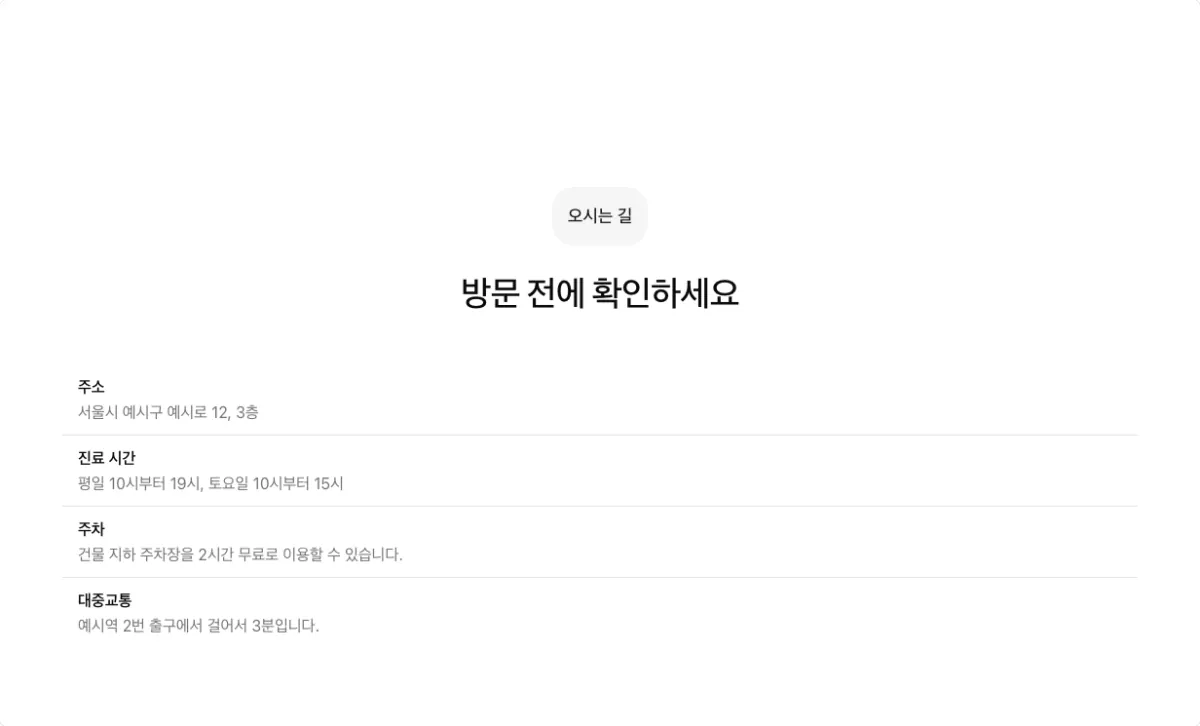
Lists short facts such as hours, address, and parking, one per row. Do not use it for a single item.
One-line list beside the heading (list, list style minimal, side by side on)

The heading on the left and the list on the right. It suits at-a-glance facts such as treatment time, anesthesia, and recovery time.
Icon list (list, list style feature)
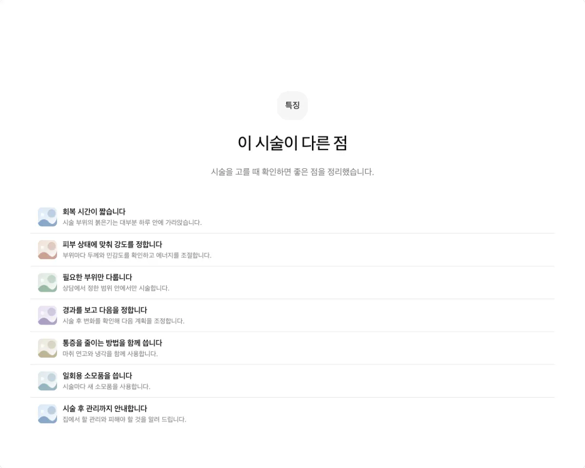
Each item has a small icon. Use it for 7 or more features. For 5 or 6, first merge overlapping items into 4 and use alternating photo and text.
List with photos (list, list style split)
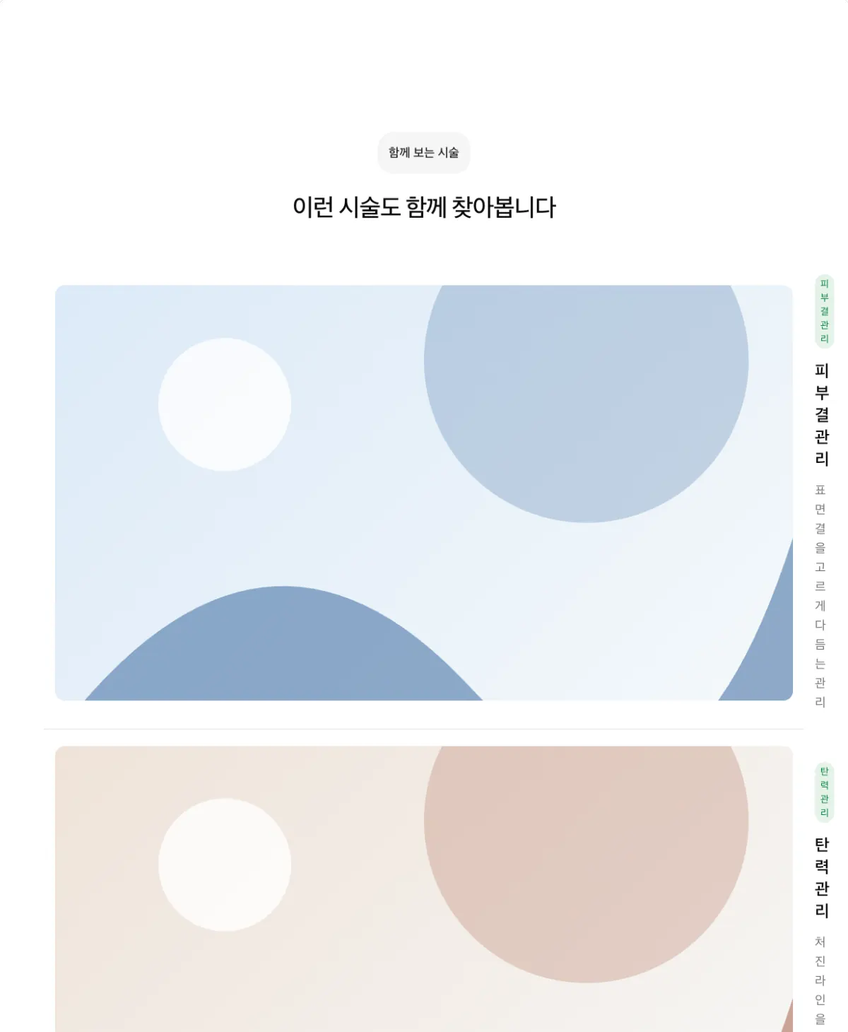
Each row has a photo and a description side by side. Use it for lists that link to other pages, such as related treatments.
Expandable list (accordion)
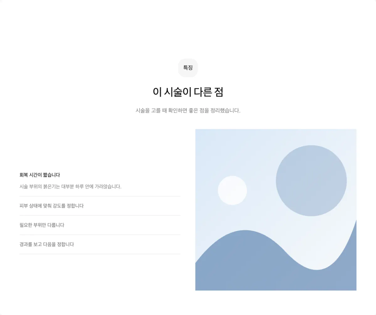
Select a heading to open its description and change the photo beside it. Keep side by side off.
Numbered expandable list (accordion-numbered, side by side on)

Collapses ordered descriptions under numbers. Use it for a process with 4 or more steps and long descriptions. This shape always has side by side on.
Expanding cards (expandable)
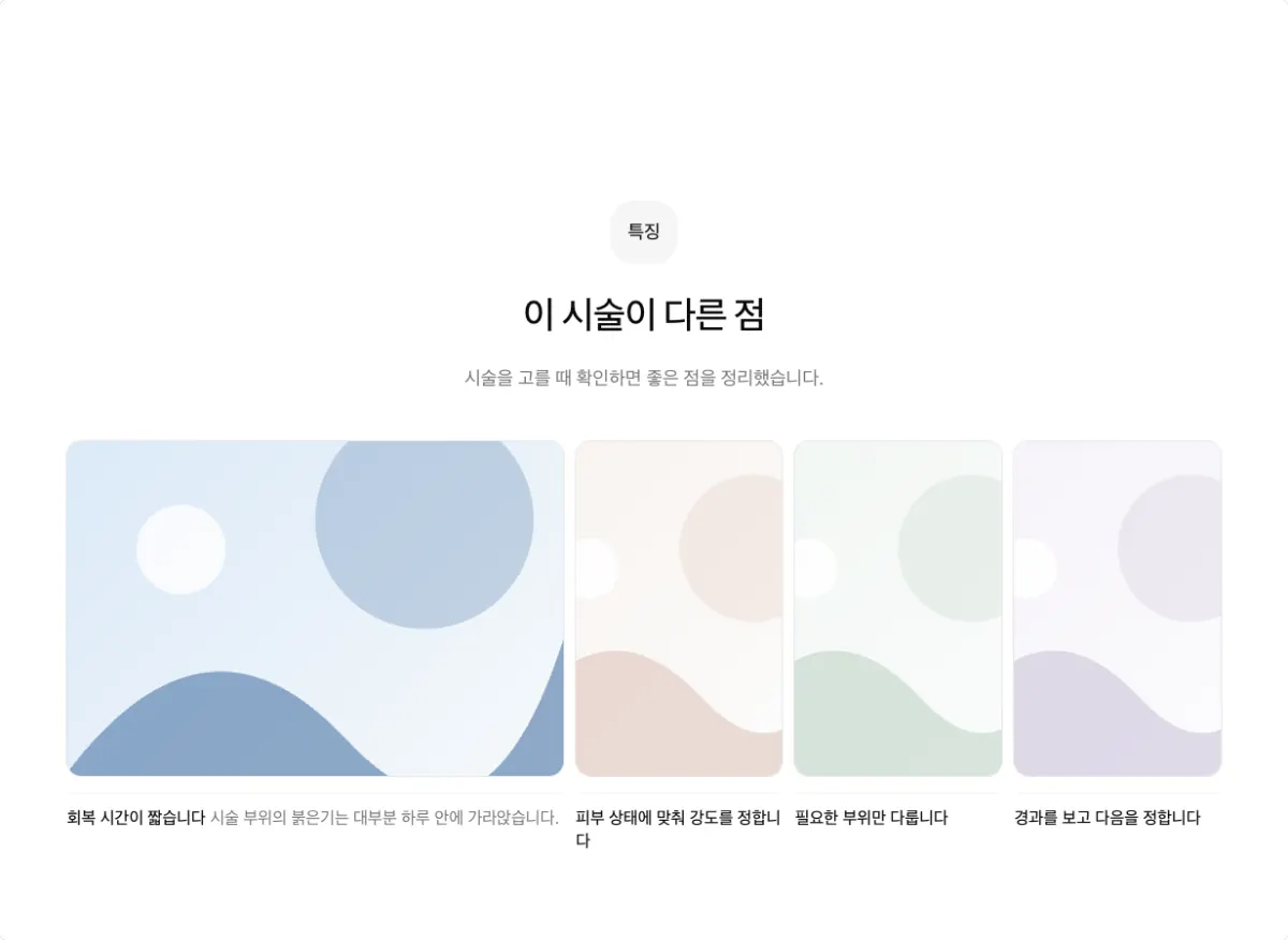
Select a card to widen it and show its description. Use up to 4 items, with side by side off.
Tabs (tabs)
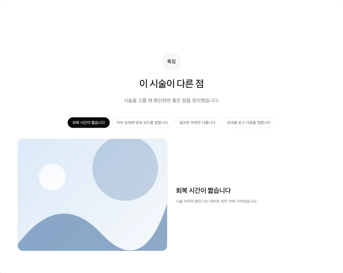
Select an item name to change the photo and description. Use 4 or fewer items, or an even number. Keep side by side off.
Steps sections: show an order
A steps section (steps) shows content in order, such as consultation to discharge or grouped
precautions. Use 2 or more steps.
Numbered horizontal steps (row-numbered)

Large step numbers in a horizontal row. It places three steps per row, so use it for 3 or 6 steps.
Divided steps (grid-divided)
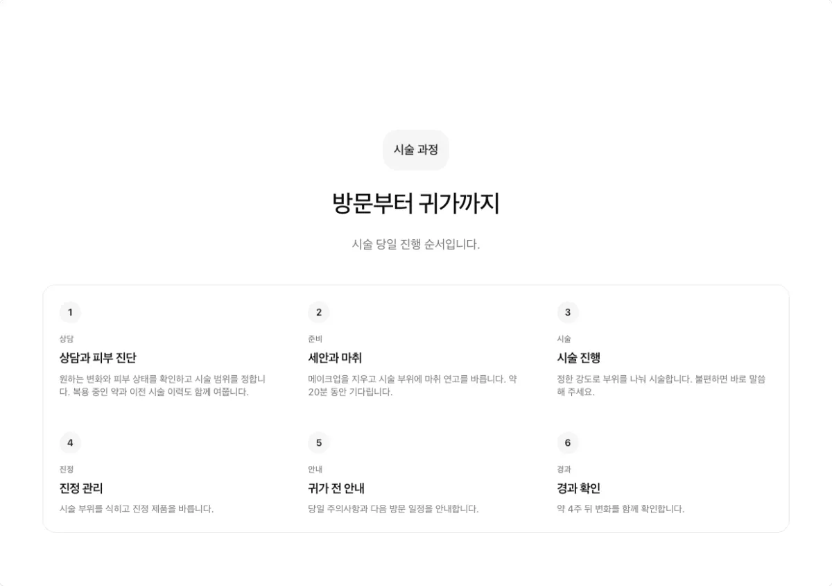
Steps in divided cells, three per row. Use it for 3 or 6 steps.
Vertical timeline (timeline, side by side on)

Steps along a vertical line. Use it for 4 or 5 steps, where horizontal steps leave empty cells. This shape always has side by side on.
Grouped precautions (timeline, side by side on, size sm)
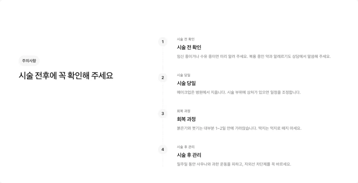
Groups checks before the treatment, the treatment day, recovery, and aftercare. If "Aftercare" and "Precautions" are separate, combine them into one section.
Stacked steps (stack, side by side on)
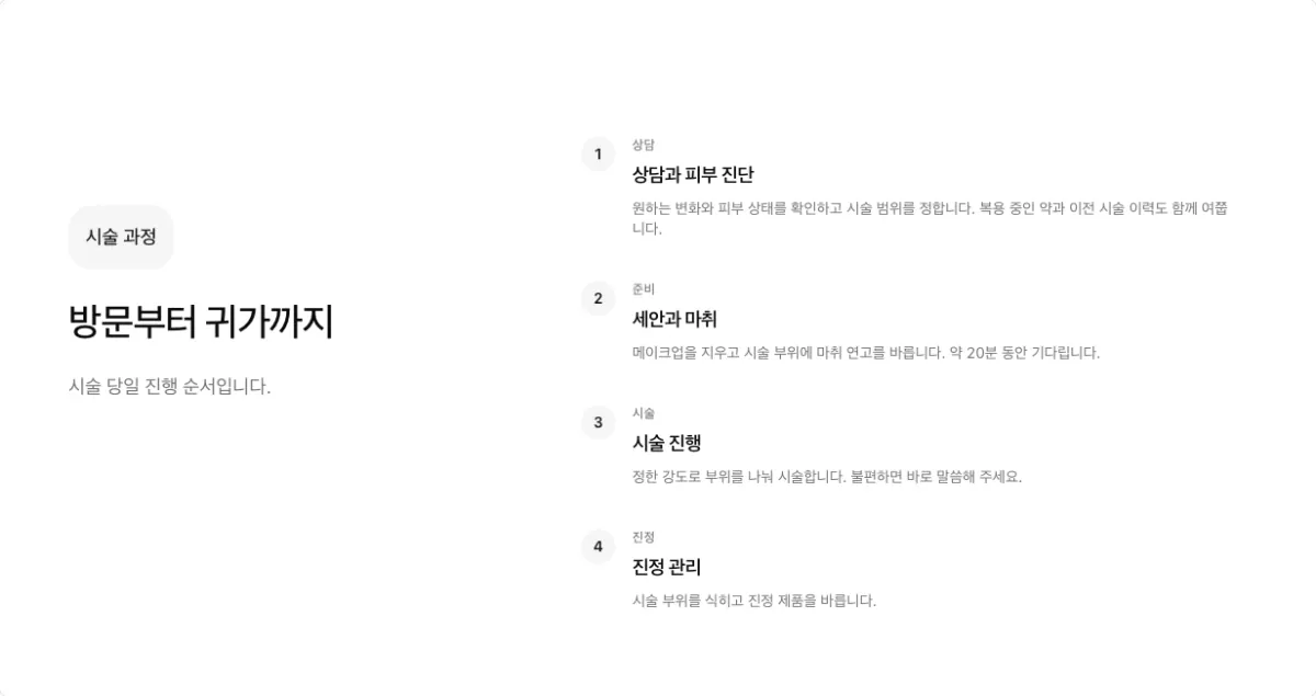
Use it when each step has a long description. This shape also always has side by side on.
FAQ sections
Expandable questions (accordion, side by side on)

The question list sits next to the heading. Select a question to show its answer. You can keep the
first question open (defaultOpen). FAQ sections use only this shape, always with side by side on.
Stats sections
Use only numbers with a confirmed source in a stats section (stats).
Number strip (strip)
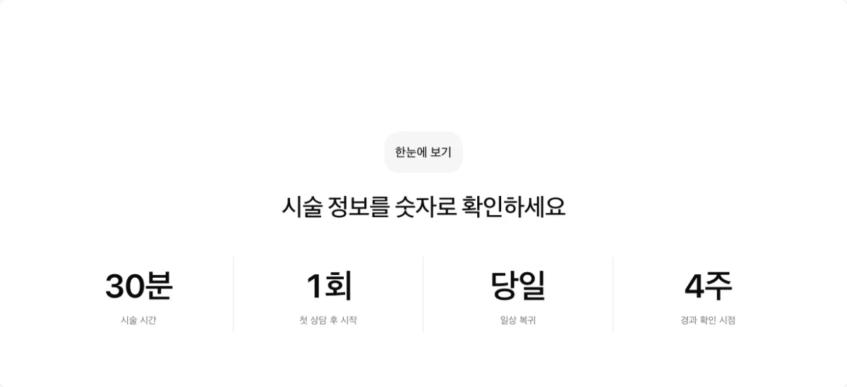
Three or four numbers in one row. Use 2 or more numbers. With 5 or more, use 8 so that each row of four is full.
Testimonials sections: reviews
Use only reviews the clinic allows you to publish in a testimonials section (testimonials).
Check medical advertising rules before you show patient reviews. Match the review count to the
column count (3 by default).
Review cards (grid, columns 3)
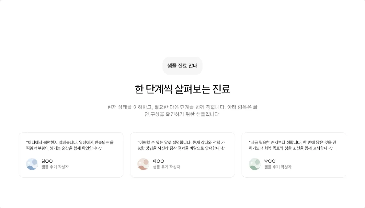
Reviews as cards side by side.
One featured review (spotlight)

Shows one main review in large type.
Case study (case-study)

A longer case with a photo.
Review slides (slider)

Shows one review at a time.
Logos sections and logo marquee
Use a logos section (logos) or a logo marquee (marquee) for conference, partner, and press
logos.
Logo grid (grid, columns 3)
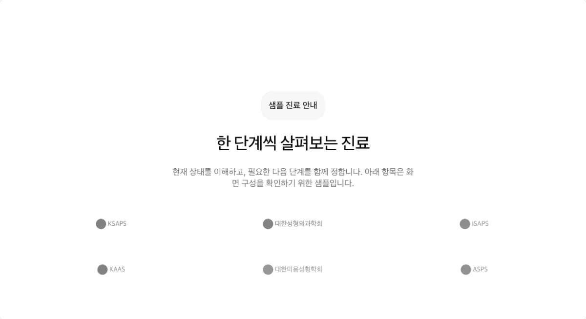
Logos in cells. The logo count must divide evenly by the column count.
Bordered logo grid (grid-bordered, columns 3)
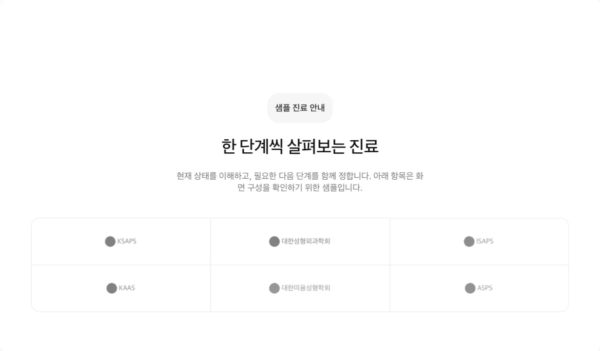
Each logo has a bordered cell. The logo count must divide evenly by the column count.
Logo cards (cards, columns 3)
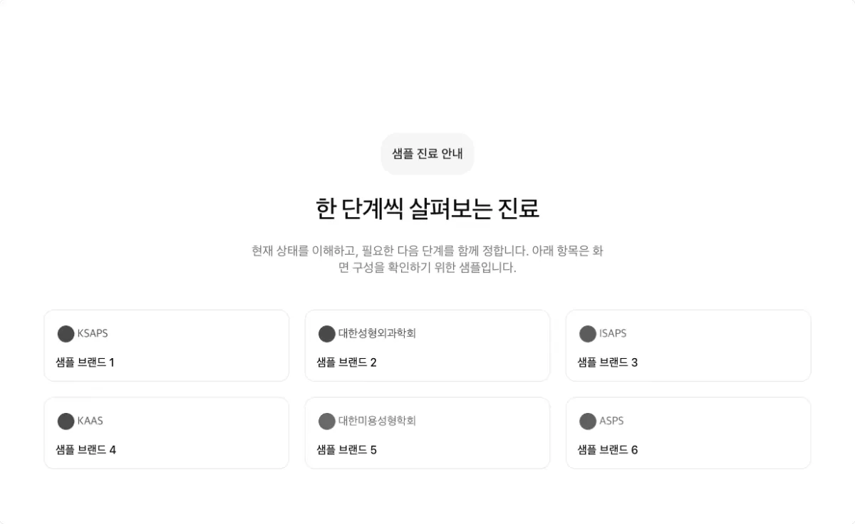
One logo per card. The logo count must divide evenly by the column count.
Orbiting logos (orbit)
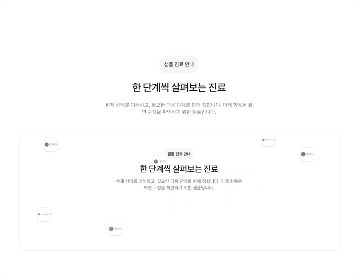
Logos circle the center. Use it for 6 or more logos.
Radiating logos (radial)
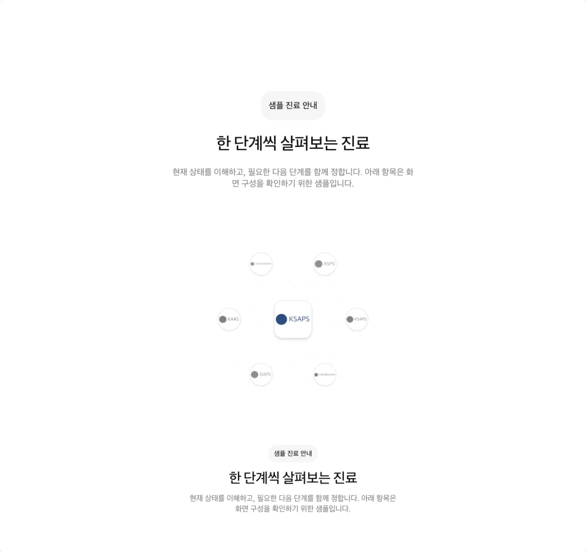
Logos spread out from the center. Use it for 6 or more logos.
Connected logos (connector)
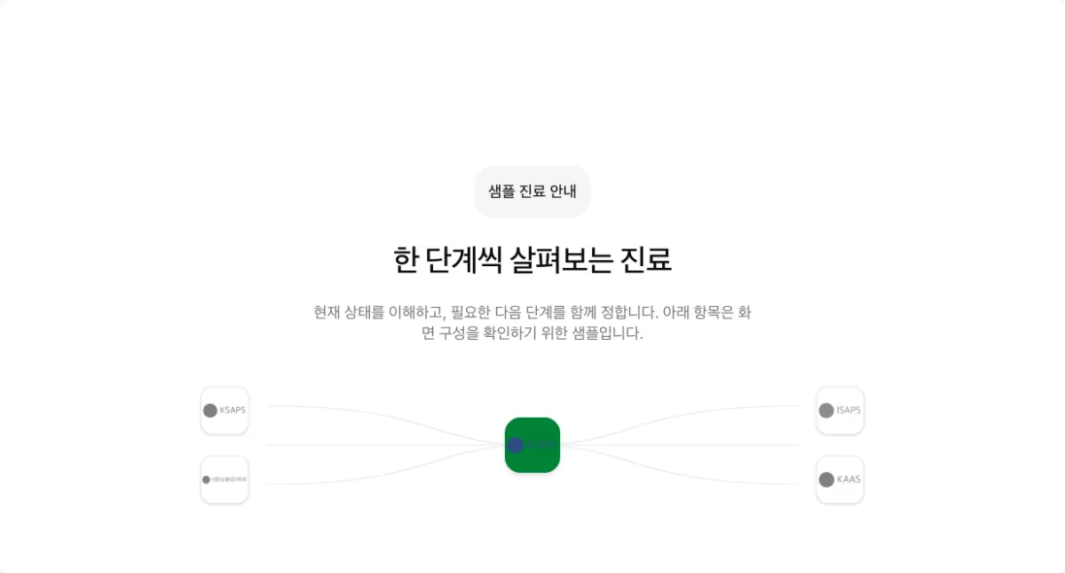
Lines connect the logos to show a relationship.
Logo marquee (marquee)
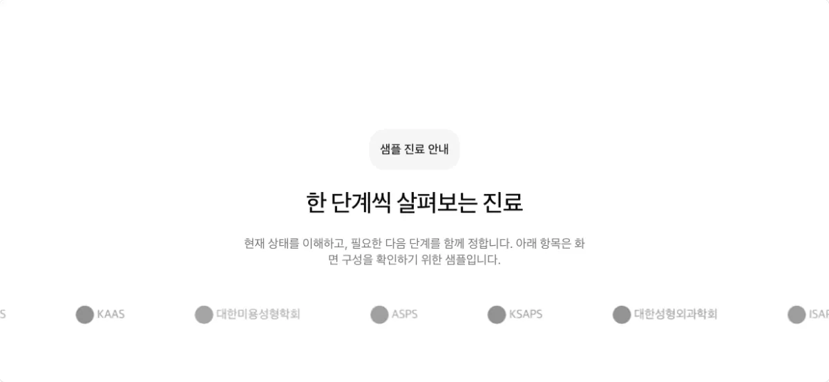
Logos scroll slowly from one edge of the screen to the other.
Markdown sections: long text
Use a markdown section (markdown) for long text, such as columns, how a treatment works, and
doctor profiles. With two or more subheadings, a table of contents appears beside the text. Use one
per page. You cannot add this section from the dashboard section screen yet. To move or upload
text, ask your Laney contact.
Long text with contents (default)
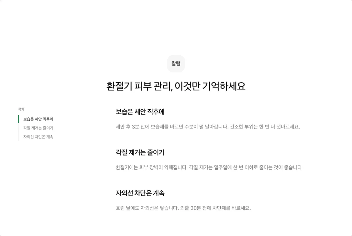
A table of contents built from subheadings follows the text.
Explainer with a diagram (lead photo cover, side by side on)
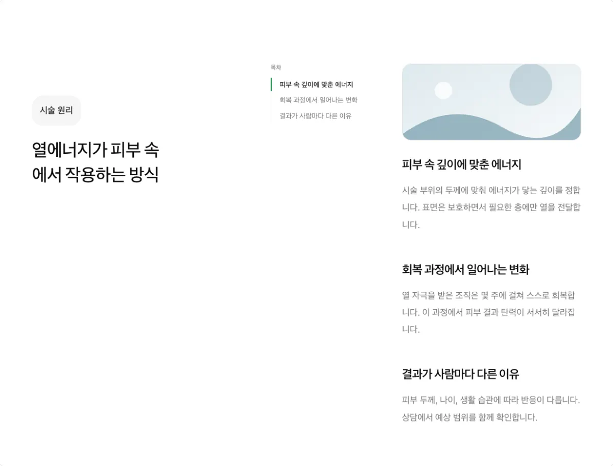
A wide diagram above the text explains how a treatment works.
Profile with a photo (lead photo avatar)

A round profile photo with a written biography.
Products sections: price lists
A products section (products) shows the prices registered on the products screen. For setup, see
Set up a commerce landing page.
Price cards (grid, columns 3)
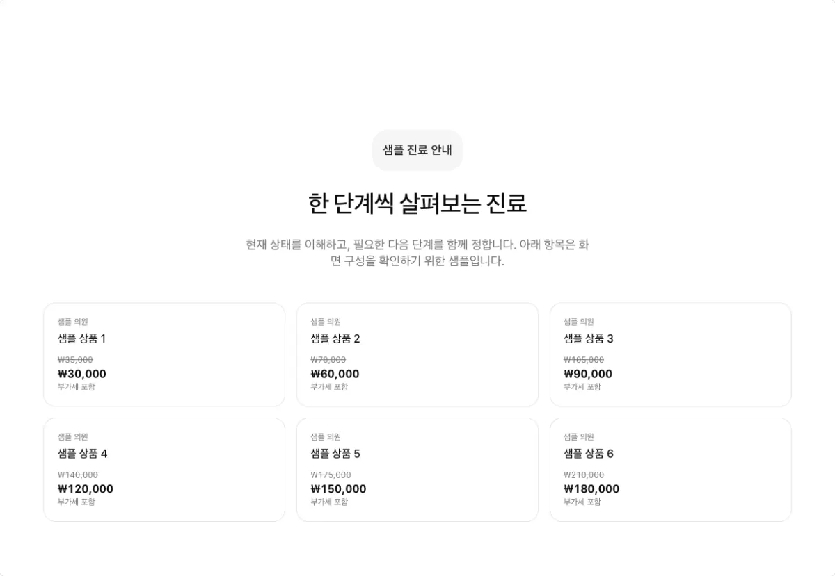
Treatments and prices as cards.
Price list (list)
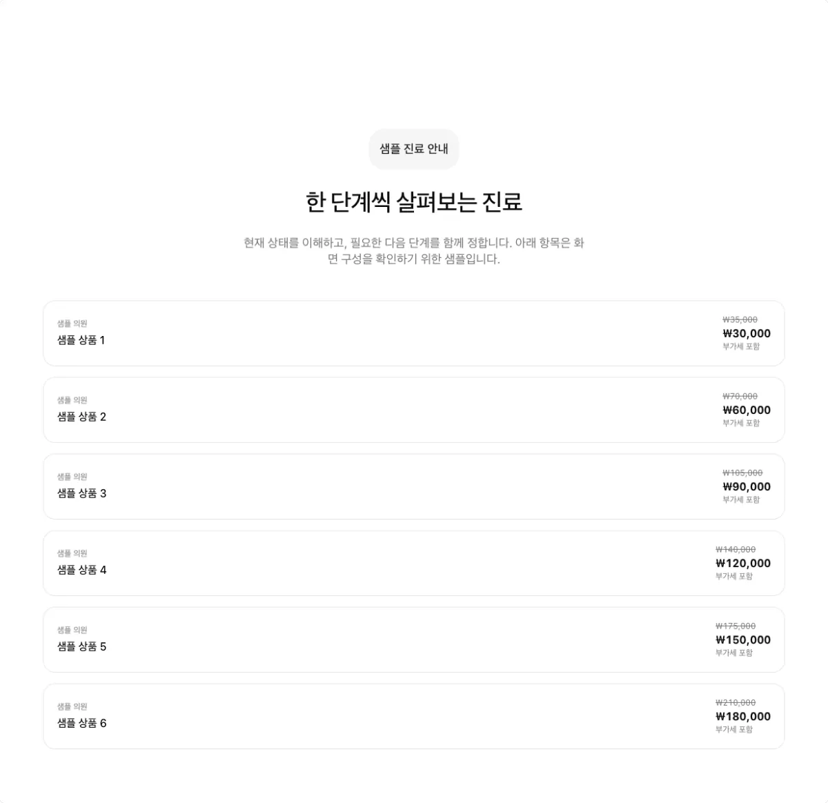
Treatments and prices, one per row.
Shapes Laney does not use
The renderer supports these layouts, but the Laney website composition rules do not use them. If a section already uses one, change it to the shape on the right.
| Section | Layout not used | Use instead |
|---|---|---|
| FAQs | Question grid (grid) | Expandable questions (accordion, side by side on) |
| Steps | Horizontal steps (row) | Numbered horizontal steps (row-numbered), or a vertical timeline (timeline) for 4 or 5 steps |
| Stats | Number grid (grid) | Number strip (strip) |
| Stats | One large number (hero-metric) | Number strip (strip) |
| Logos | Logo row (row) | Logo grid (grid) or logo marquee (marquee) |
Put the heading on the left
Turn on Side by side (split) to put the section heading and description on the left and the
items on the right. It shortens the page, and alternating it with centered sections gives the page
rhythm.
Some shapes have a fixed setting.
- Always on: FAQs, vertical timeline and stacked steps in steps sections, numbered expandable list, a card group with one item, and stacked text on photos
- Always off: expandable list, expanding cards, tabs, alternating photo and text, one large and two small photos, mixed-size photo group, text on photo tiles, numbered horizontal steps, and divided steps
- Your choice: one-line list, and a card group with 2 or more items
For the shapes where you choose, each pair shows the option off (left) and on (right).
One-line list
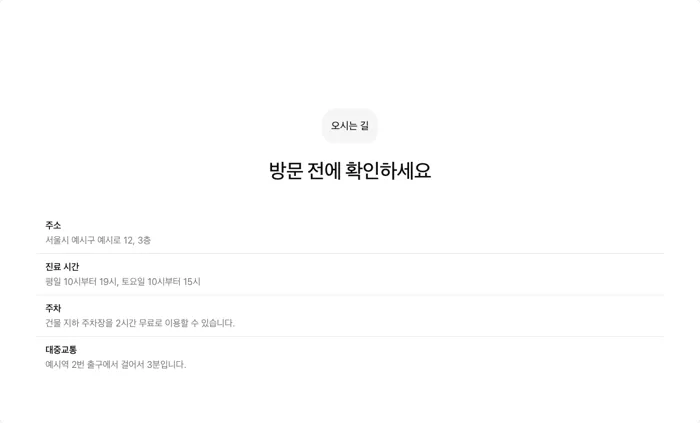
Side by side off

Side by side on
Card group
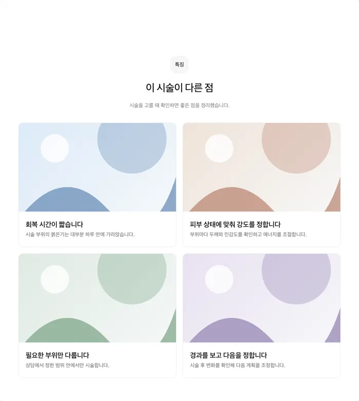
Side by side off
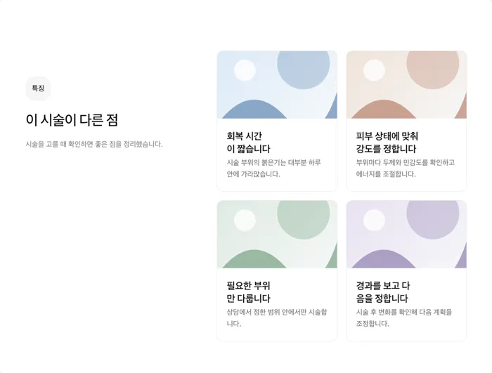
Side by side on
In a content section, side by side only moves the heading to the left. The shape barely changes.
What you can adjust
These options work in every section. Change them in the section Options, or ask the AI.
| Option | Values | Effect |
|---|---|---|
| Side by side | split on, off | Puts the heading on the left and the items on the right |
| Background color | background, muted, primary, secondary, foreground | The section background. Alternate it between neighbors to separate sections. |
| Size | sm, md, lg | Heading size and vertical spacing |
| Alignment | center, start | Puts the heading in the center or on the left |
| Width | contained, full | Keeps the section in the center column or stretches it to the screen edges |
| Show photos | On, off | Hides photos in this section only. The content keeps its photos. |
Features sections with cards and lists have more options.
| Option | Values | Effect |
|---|---|---|
| Item count | Number of linked child content items | Number of cards or rows. Match it to the column count to avoid empty cells. |
| Columns | 1 to 4 | Cards per row |
| Photo ratio | square, photo, video, wide, tall | The crop ratio for card photos |
| List style | minimal, feature, split | Icon size and columns in the one-line list |
FAQ sections can keep the first question open (defaultOpen) or open several at once
(allowMultiple). Steps sections can change the marker between steps (connector). Stats
sections can count up numbers (animate).